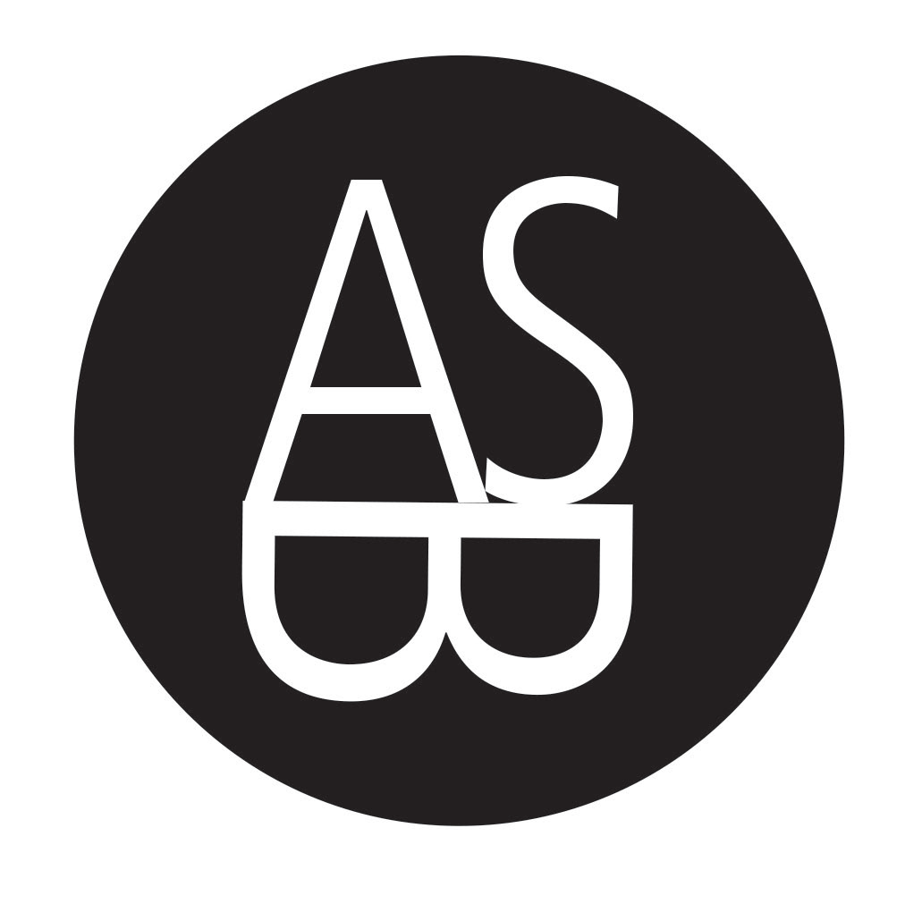
In my graphic design class, I was instructed to design a logo with a circle and my three letters. I could not use any other shapes or effects in the design, and it had to be in black and white only - no colors, grayscales or gradients. I decided on a clean and modern geometric design, and I arranged the letters so that the “A” and “S” sat on top of a “B” that had been turned around and provided a nice and balanced support for the top letters. Given the confinements of the assignment, I thought it would be difficult to achieve a logo design that was strong and interesting, but for me, this was successful. It’s simple yet effective, and I plan to use the design in the future.